Battle Pirates (Kixeye)
Role: Concept Artist / Production Artist: Shared Creative Services Team
Overview
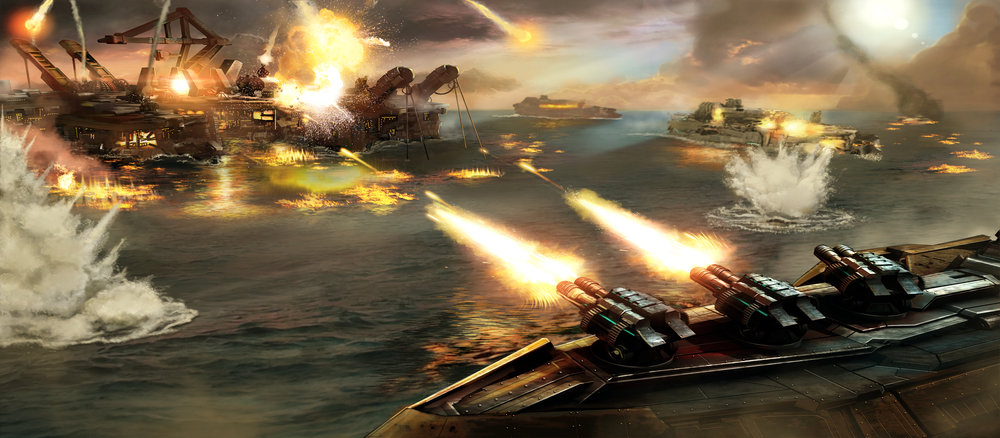
Set in a dystopian ocean world ruled by warring factions, Battle Pirates brought “Mad Max on water” energy to the real-time strategy genre. Players command naval fleets, build fortified bases, and battle both AI and other players for resources and territory.
As part of Kixeye’s Shared Creative Services Team, I developed concept art, production designs, and marketing visuals that supported the game’s evolution and helped define the post-collapse aesthetic that players came to love. My contributions included ships, base structures, faction identity designs, and promotional materials, all built to reinforce the game’s gritty, scavenger-war tone.
World-Building and Faction Identity
Faction-based visual identity: combining post-collapse militarism with modular, scavenged design.
The Battle Pirates universe takes place in 2067: a world devastated by rising oceans, where the survivors wage war for control of the last remaining landmasses. My designs helped visualize this tension between decaying industrial relics and improvised future technology.
Each faction, from the disciplined Draconians to the feral Forsaken, required a distinct material language, rusted alloys, jury-rigged hulls, mismatched plating, balancing realism with stylized legibility.
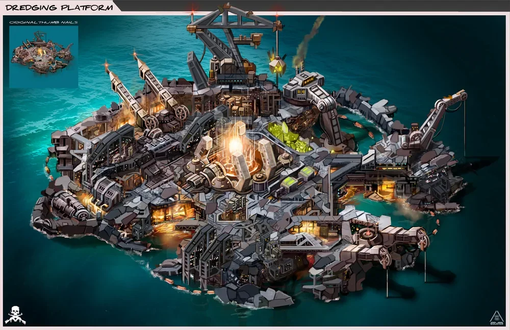
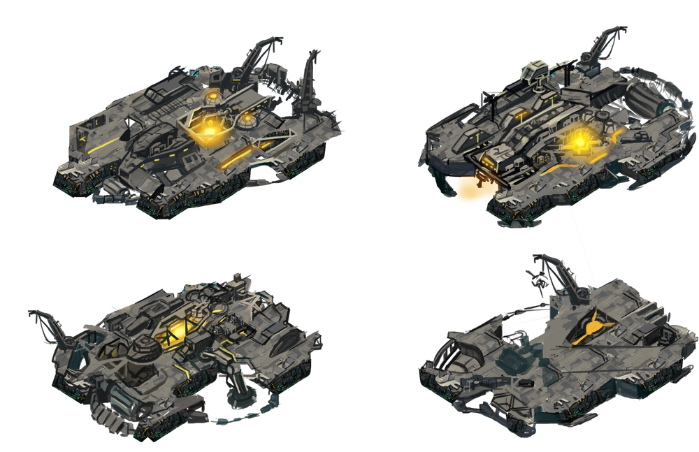
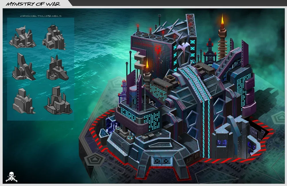
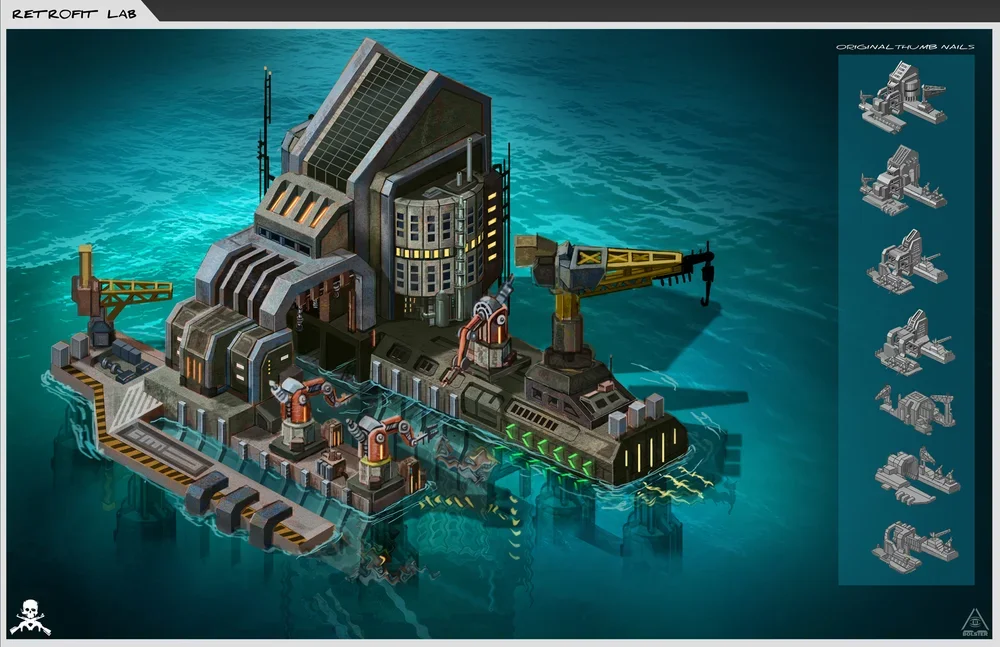
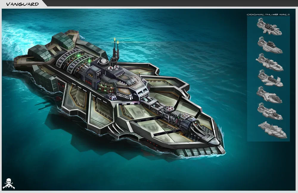
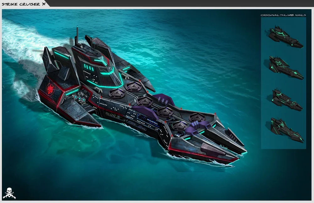
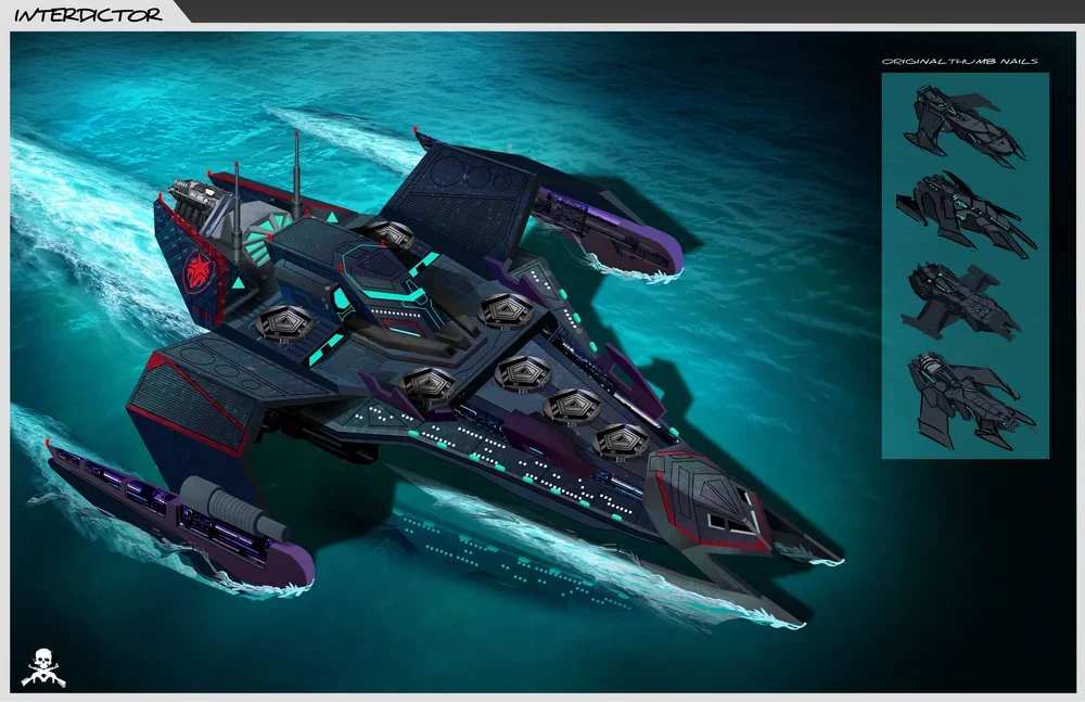
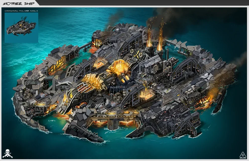
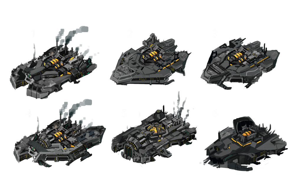
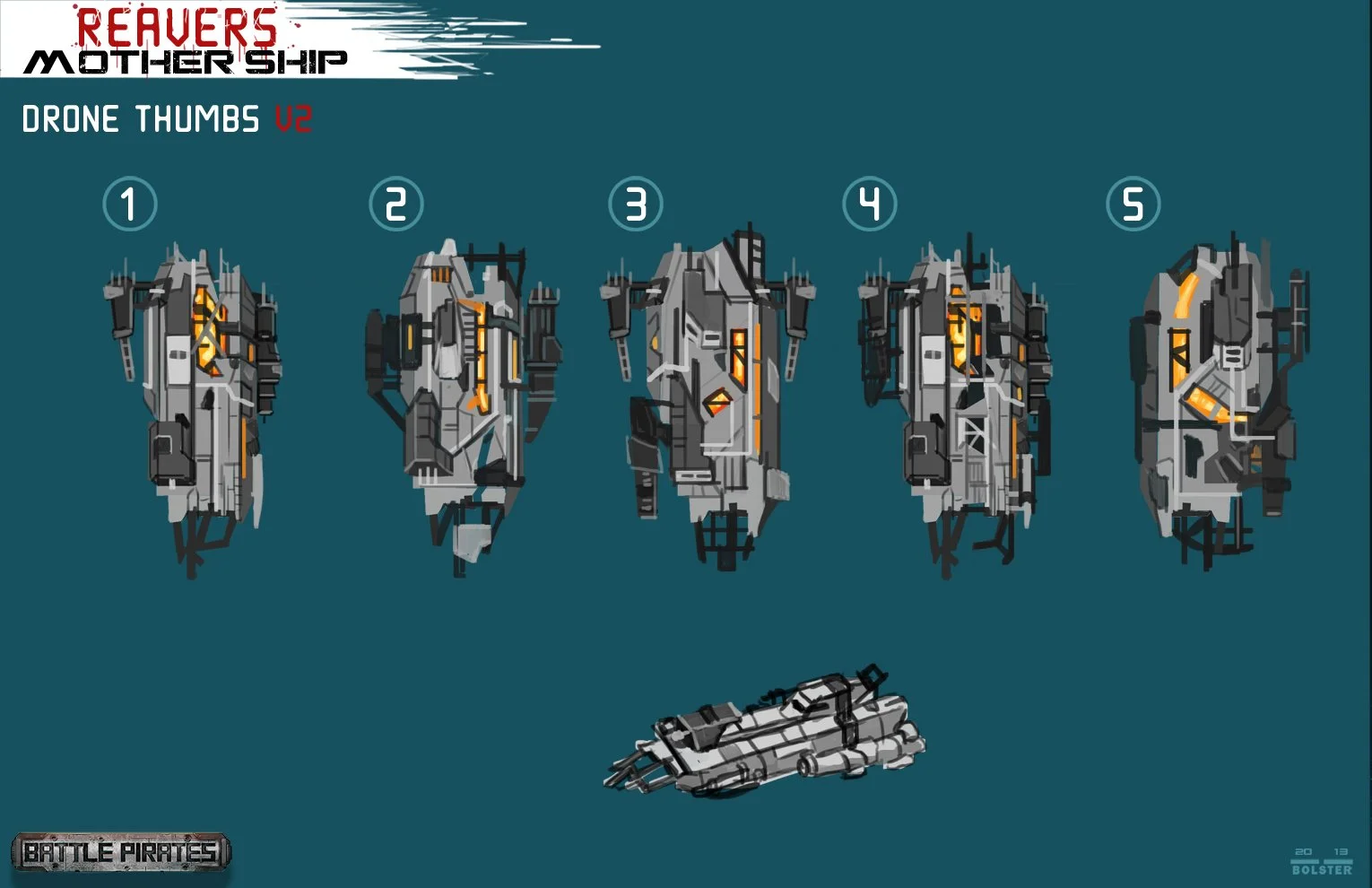
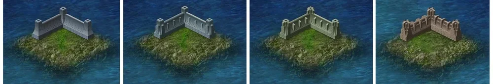
Ship and Structure Design
Ship and base designs balancing gameplay clarity with grounded sci-fi engineering
Ships were designed to feel brutal, efficient, and distinct between factions. I focused on readable silhouettes, clear upgrade paths, and believable mechanical layering that created the illusion of functionality while keeping each hull battle-ready at thumbnail scale.
For base structures, I worked at both the pixel and concept level, painting final blocks for in-game implementation while designing new platforms, outposts, and weapons for expansion updates.

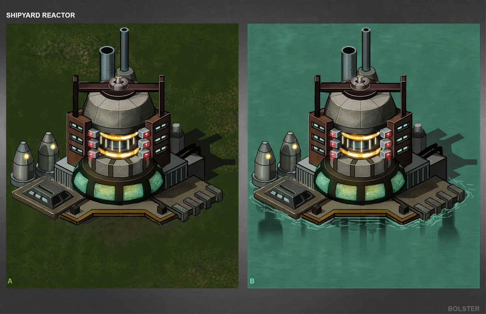

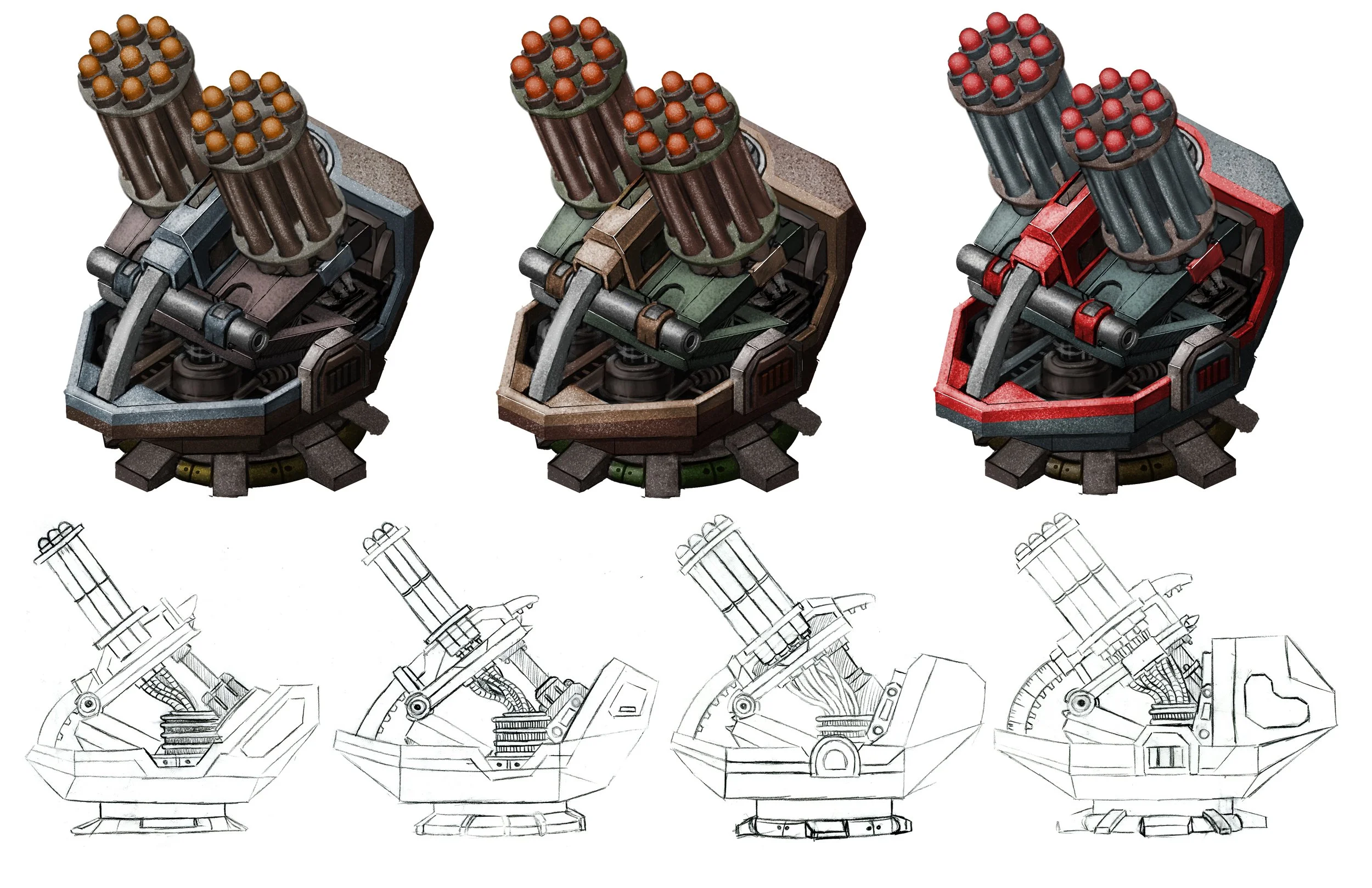
Weapons, Defenses, and Engineering Aesthetics
Production art for defense systems and advanced weapons: designed for clarity, scale, and player anticipation.
My approach to weapon and wall design emphasized tactical silhouette readability while retaining a believable mechanical build. Every design: from missile silos to wall segments needed to communicate immediate threat and power through lighting, proportion, and motion language.


Banners, Icons, and Marketing Materials
Faction banners and promotional assets: extending the world’s tone into UI and community spaces
I also developed faction banners, event icons, and marketing visuals used both in-game and for external campaigns. These assets served as emotional touchpoints, rallying symbols that connected players to their chosen faction and the game’s lore serving the same emotional purpose as what you would find on an action figures packaging.
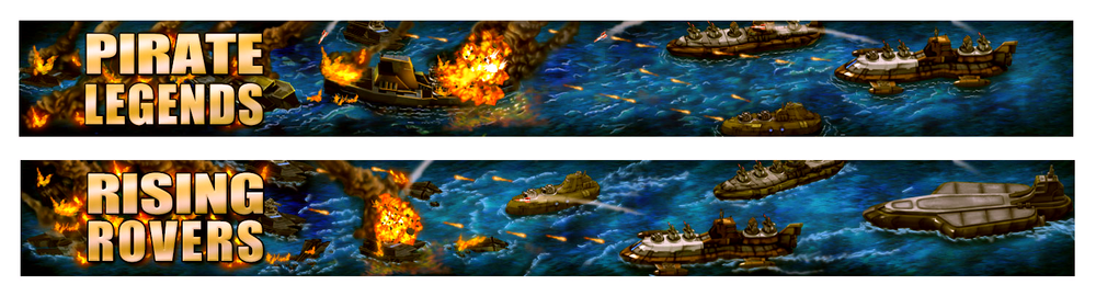
I also developed faction banners, event icons, and marketing visuals used both in-game and for external campaigns. These assets served as emotional touchpoints, rallying symbols that connected players to their chosen faction and the game’s lore.
Creative Intent
Industrial dystopia meets strategic readability: world-building through scarcity and conflict.
Across my contributions, the goal was always to ground the spectacle, to create a visual world that felt harsh, real, and tactically driven, while still maintaining an elevated sense of design. Every ship, platform, and weapon had to feel engineered from survival instinct and desperation.