
A “creative” rebirth for Solitaire TriPeaks, unifying tone, emotion, and design into a living brand system built to endure.
The TriPeaks “Creative” Renaissance
At a time when performance marketing had plateaued, I rebuilt the creative foundation for TriPeaks Solitaire, transforming it from template-driven ads into a living storytelling system. The campaigns I directed outperformed studio benchmarks by over 300%, converting clicks into paying players at record rates.
To scale that success, I designed a modular character-puppet and asset system—a toolkit that let other artists produce ads with the same emotional clarity and rhythm that drove my original results. Each component was built for experimentation: theme, tone, and movement could be reconfigured, tested, and taught across teams.
The outcome wasn’t just stronger metrics—it was a cultural reset. By merging cinematic storytelling with systematic iteration, we reintroduced creative intelligence into the ad pipeline, making art and analytics speak the same language again.
Quick & Dirty to Systematic Creativity
At first, our ads were reactive: bright colors, quick hooks, short-term wins. But the brand had lost its human spark. I proposed a reboot, one that treated marketing not as output but as storytelling infrastructure. We started with rough “quick & dirty” tests that mixed humor, empathy, and narrative. Simple setups: players arguing, laughing, or failing dramatically, outperformed our polished cinematic spots. These sketches became creative blueprints, teaching the studio that emotional truth converts better than visual noise.
Quick & Dirty: UA-Led Reverse Engineering
Early on, our UA analysts asked me to recreate competitor top-performers rather than “make it look like the game.” The brief was simple: clone what’s winning in the market for our brand and test fast.
A/B Deck Test: Establishing a Baseline
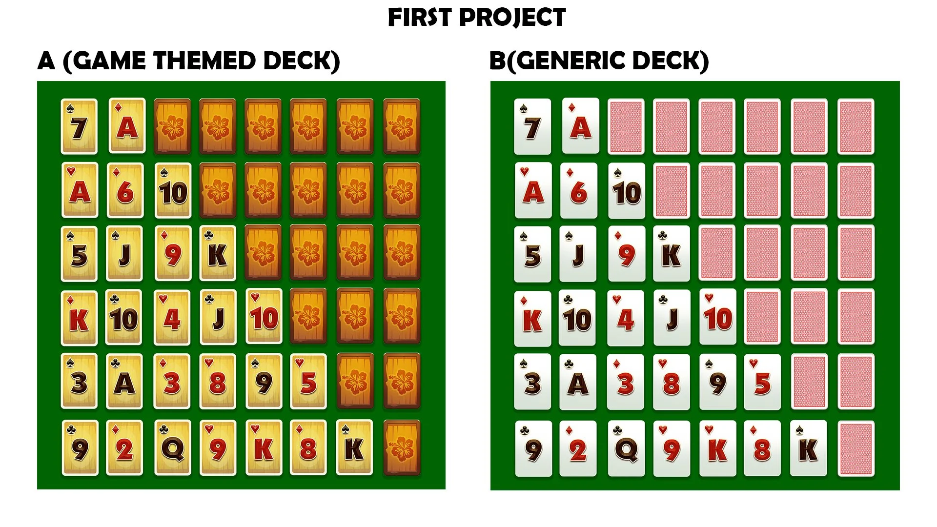
What this was: A fast baseline to see if a generic deck vs. TriPeaks-styled cards changed click-through/curiosity when everything else was kept simple.
Goal: Not to find a winner, but to calibrate our starting point before cloning outside winners.
Water Hose” Clone Test, Based on Grand Harvest

What this was: A purposeful clone of a Grand Harvest top performer, requested by the UA manager. I re-shot/comped it in a tropical TriPeaks backdrop so it sat inside our world, but the mechanic and gag mirrored the competitor.
Result: This did not beat existing winners at the time. It validated the benchmark and gave us a read on how much “clone vs. brand” we could get away with.
First “Finger” Ad, Human Touch + Depth
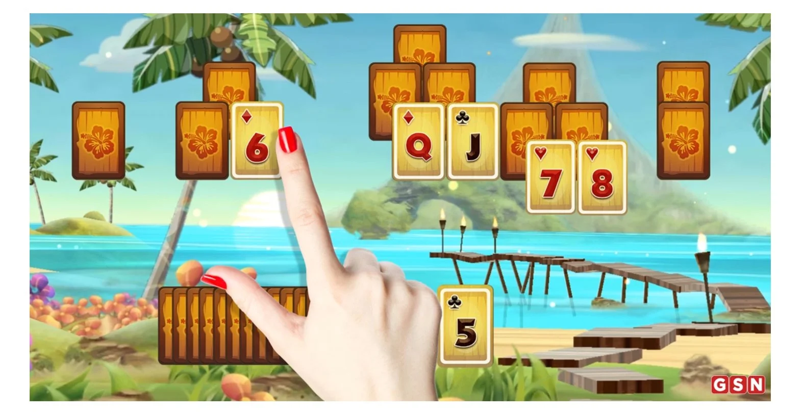
What this was: A quick pivot from hard cloning to ownable feel—keeping the fast, readable mechanic but adding a real finger interaction and 3D deck depth.
Impact: This became the first internal ad to meaningfully challenge the pack and later took over as the team’s go-to direction.
Quick Marquee Test, Bringing Tiki & Pele On-Brand

What this was: A light-lift brandability test: could we keep the speed of UA clones but inject character and neon marquee drama for scroll-stopping personality?
Outcome: Not a runaway winner, but it proved character energy had legs, which informed later directions.

Pele’s redesign became a turning point.
Pele’s redesign proved how powerful marketing can be. She didn’t just driving installs. the design inspired the product team to evolve game the character art in-game. Her elemental energy helped make the world of TriPeaks feel truly alive.
The TriPeaks UA Creative Ecosystem
A modular system built to unify design identity, storytelling, and analytics.
Each phase, from character design to data refinement reinforced scalability and measurable creative performance across internal and partner teams.

Creative Task Force Launch
To scale the momentum, leadership formed a small cross-disciplinary unit, writers, artists, and editors working like a rapid-response creative lab. Our goal: prototype faster, fail smarter, and turn wins into reusable templates.
Over six months, this task force rebuilt the creative pipeline from gut instinct to informed experimentation. By sharing rigs, voice assets, and compositing systems, we cut production time by 60% and built consistency across campaigns. What began as scrappy “what if” ideas evolved into a repeatable content machine, fast, funny, and emotionally resonant.

Creative Testing Framework
Developed by Senior Content Manager: Allegra Garabedian
Allegra and I refined the workflow into a structured Creative Testing Framework, a living system that documented every variable of creative testing. It outlined tone, pacing, character archetypes, and emotional triggers, letting our teams measure creative intuition with data.
The framework became a shared language between marketing and production, a way to test curiosity, not just clicks. It replaced opinion with iteration, and turned the creative process into a scalable methodology. In a studio where every ad once felt like a gamble, we now had a map.
From Static Success to Motion Storytelling
The first wave of static testing on Pinterest and Facebook validated that our new creative framework could predict performance, but it also raised new questions. Why were certain images connecting so strongly, and could that same emotional energy translate into motion?
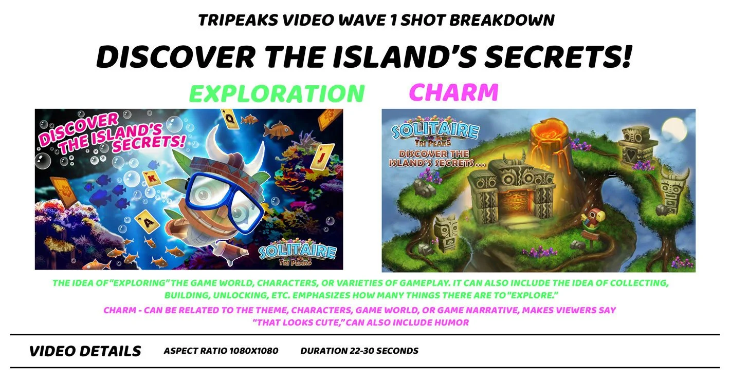
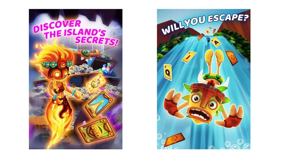
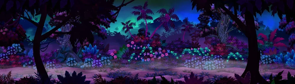
To find out, I took the highest-performing static pieces: “Discover the Island’s Secrets” and “Escape the Crystal Cave”, and began translating them into cinematic motion studies. “Discover the Island’s Secrets” became the proving ground for that leap: a dark, mysterious jungle brought to life through lighting, atmosphere, and the emotional tone of discovery.
The success of this piece led to the shorter, high-energy follow-up “Take the Plunge”, a six-second test that distilled the same storytelling DNA into a format built for speed, rhythm, and performance channels.
intro: (2 secs) open on view overlooking tropical island from the view of standing on the beach looking out to the ocean. COPY: “Discover the island’s secrets!” animates in from off screen.
transition: (1 secs) motion blur, copy animates out.
footage: (5 secs) camera zooms backwards, brush, leaves, and other tropical foliage rushes past camera. ( 3D parallax camera movement)
footage: (6 secs) camera lands on environment with lots of tiki statues and a cave with an undiscovered feeling of mystery. camera zooms into cave filled with piles of glowing crystals and treasure, as the camera moves in mystery cards shoot up from the treasure and flip to reveal the volcano card.
transition: (1 secs) cross zoom, camera zooms into card and zooms out showing gameplay footage featuring the volcano card in game.
outro: (3 secs) camera lands on view of the island with flaming volcano. playing cards animate in over CTA: “EXPLORE NOW!” and “PLAY NOW” button. animated logo with torches and light streak.
Ad Campaign: Discover the Island’s Secrets
Theme: Exploration and Charm
Discover the Island’s Secrets marked the first time our team transitioned from static imagery into full cinematic motion, and with it, the beginning of TriPeaks’ modern brand identity. The concept started as a test: could we take the visual and emotional appeal of the top-performing Pinterest ads and translate that into a dynamic short film that felt alive, mysterious, and immersive?
Working without a strict in-game reference, I was given the freedom to imagine what a dark, mysterious jungle might look like within the TriPeaks universe. The base game art at night was desaturated and flat, so I rebuilt the world with new color and atmosphere — mixing cool blues and greens with fiery volcanic tones to create visual tension. Inspired by natural storm patterns around volcanic islands, I added lightning flashes, mist, and atmospheric thunder to heighten the drama.
Crystals, ruins, and totems from the game were re-lit and graded to evoke the emotional texture of the original static ads, while dynamic camera moves and compositing effects gave the illusion of a living, reactive environment. The result became the blueprint for TriPeaks’ “mystery jungle” aesthetic: a visual language that was later referenced in multiple campaigns, key art, and partner toolkits.
This single experiment ultimately influenced product design conversations including: how the opening levels of the game could feel more atmospheric and emotionally resonant for new players. What began as a visual test became the creative DNA for the brand.
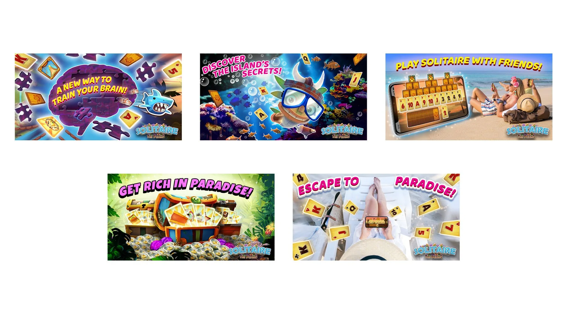
Pinterest Static Ad theme test
Ad Campaign: Take the Plunge
Theme: Exploration and Charm
Created as a 6-second, high-tempo experiment, Take the Plunge pushed the limits of our newly established design system. Working with only static PNGs of Tiki and Poi, I re-posed and composited them into dynamic 3D arrangements that conveyed movement and emotion with minimal animation: a balance of speed, energy, and personality.
The spot explored how our characters could carry both mood and story through lighting, composition, and rhythm rather than traditional dialogue or gameplay. I treated the jungle environment as a living emotional space, painted and lit for atmosphere rather than literal accuracy. We tested how far the brand’s assets could stretch to express tone, adventure, and heart.
Take the Plunge proved that even within a limited toolkit, careful posing, lighting, and direction could create the feeling of depth and cinematic scale. It became a key step in defining how TriPeaks could express “exploration” and “charm” visually, paving the way for character-driven storytelling in later campaigns.
Parallel Explorations: The Human Angle
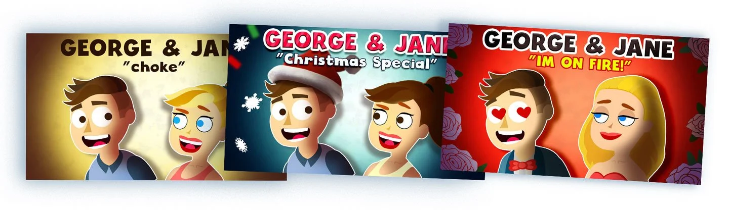
While the team refined the Tiki and Pele creative system, I also developed a parallel series featuring “George and Jane”, 2D characters that could act as “real life player” ads that brought humor and personality to the TriPeaks brand. These “Real Player” pieces became our emotional A/B counterparts to the animated campaigns, testing relatability against spectacle
Character Sizzle Reel “Solitaire TriPeaks”
A highlight reel celebrating the successful rollout of new Solitaire TriPeaks characters and their impact on the game’s creative strategy and economy. These character introductions revitalized our brand presence, helping our social ad performance on Facebook reach competitive industry benchmarks.
The video showcases our end-to-end development process, from internal design documentation to partner-ready visual guides, demonstrating how flexible character systems empowered our content team to test new themes and creative directions efficiently.
Edited and assembled to reflect the collaborative energy behind the project, this piece captures both the charm of the characters and the measurable business lift they brought to the TriPeaks ecosystem.
Ad Campaign: “Sleeping Tiger Card Flip Fail”
This ad was developed as part of our theme testing strategy, blending the Strategy and Charm pillars from our creative framework. It transformed a simple card flip into a moment of tension and humor. Now The clock is ticking, each move could awaken the tiger and lead to an unexpected, animated “FAIL.”
The concept tapped into the puzzle aspect of Solitaire TriPeaks while emphasizing emotional engagement through slapstick storytelling. By mixing danger and comedy, it challenged viewers psychologically. The idea is inviting them to think, “Can I do better?”
This piece stood out in A/B testing for its high completion rates and strong retention impact. It proved that gameplay-driven storytelling could outperform traditional static ads, paving the way for future creative experimentation within the TriPeaks campaign ecosystem.
Tutorial Concept: “Tiki’s Big Win” (Day Version)
Developed to explore the Relaxation theme from our testing strategy, this concept presents Solitaire TriPeaks as a tropical escape — a world of calm, clarity, and satisfying reward.
The environment was designed to feel lush and inviting, inspired by the fantasy of an island paradise. Tiki interacts directly with the player’s hand and cards, turning the tutorial into a friendly, character-driven moment of discovery.
The sequence builds toward a bright burst of achievement as the treasure chest opens. This reinforces the emotional loop of relax → play → win. This simple moment of payoff captures how thoughtful animation and environment design can make learning the game feel genuinely rewarding.
Holiday Reskin: “Explore a Solitaire Wonderland”
With the new character and world systems in place, we reimagined “Discover the Island’s Secrets” as a festive, holiday-themed variation. a test of how far our creative framework could stretch while staying true to brand.
This version focused less on core card gameplay and more on parallax motion, warmth, and character relationships, particularly the bond between Tiki and Poi, his beloved masked dog. The goal was to evolve the visual language. We kept multi-layered camera movement but updated the visuals to show seasonal details that aligned with best practices for Facebook and mobile performance.
Set in a snowy re-skin of Tiki’s tropical world, the ad balanced charm and exploration, capturing the feeling of festive discovery without losing the game’s identity. It became a key experiment in how storytelling, animation depth, and emotional tone could combine to keep long-running campaigns feeling new.
Action Gameplay “High Impact Mock Gameplay”
A fully animated recreation of gameplay: engineered for rhythm, emotion, and control. Built entirely in After Effects using game assets to test pacing, biomes, and player impact.
While most best practices suggest using raw gameplay footage, we consistently found that unedited gameplay failed to perform. Viewers disengaged before the most exciting moments could unfold.
To solve this, I proposed creating fully animated mock gameplay sequences in After Effects, built from in-game assets but with complete control over timing, rhythm, and composition. This approach allowed us to amplify the emotional peaks of play while maintaining an authentic look and feel.
By designing the entire scene, from backgrounds and card motion to dynamic hand interactions, we could emphasize the most rewarding and high-octane moments of the player experience. It also gave us total flexibility for testing biomes and color environments, helping us identify which visual contexts correlated most with real installs and engaged players.
This spot was categorized under Exploration, though it also speaks to Action and Mastery, representing the thrill of precision and success in motion.
Partner Ad Extensions
Building on the success of our internal campaigns, the creative system evolved into a framework the studio could keep scaling. Using the TriPeaks animation rigs, modular character sets, and thematic foundations, partner studios were able to explore new directions in tone, humor, and storytelling, all while staying true to the brand’s identity.
This phase proved the system’s lasting value: it wasn’t just a set of ads, but a living creative language that allowed the brand to keep testing, learning, and refining its voice across multiple markets and collaborators.
Treasure Shrine (Partner Ad)
Studio: Solitaire TriPeaks / GSN Games
A proof of concept for scalable creativity — partner studios using my Mystery Theme system to match tone, pacing, and brand emotion with precision.
The Wild Bunch (Partner Ad)
Studio: Solitaire TriPeaks / GSN Games
Type: Partner Execution — Creative Brief by Jonathan Bolster
A showcase of the TriPeaks 2.0 humor toolkit in action — demonstrating how tone and animation systems could adapt across genres without breaking identity.
Theme: Charm - Social - Strategy
Desert Decision (Partner Ad)
Studio: Solitaire TriPeaks / GSN Games
Type: Partner Execution — Character Comedy
An example of the framework’s adaptability — partner teams applying my rig and timing systems to sustain clarity, warmth, and humor across markets.
Theme: Charm - Relaxation
Expanding the World of Tiki
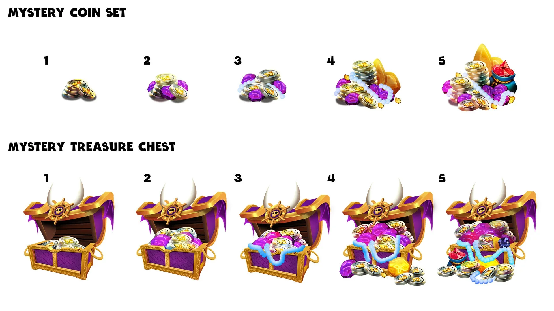
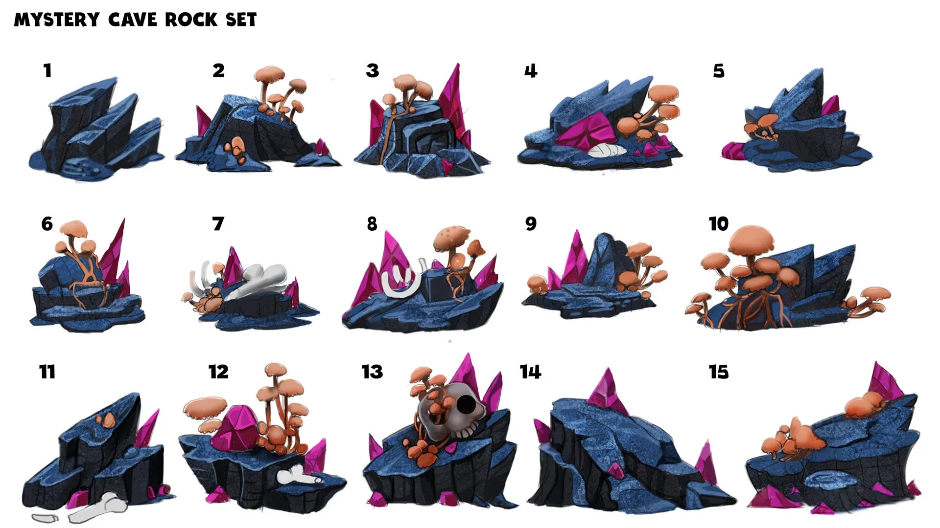
AAfter the success of several prototype campaigns, I led the marketing artists in creating a modular art pack built from the jungle and cave assets developed for our early “Mystery” and “Escape” themes. I designed a sharing system that allowed external partners to easily drop these assets into their workflows, enabling rapid-fire compositions that still felt unified with the tone and mood we’d established during testing.
The result was a scalable visual language—consistent across teams and networks—that proved high-performing creative didn’t require our internal artists to be hands-on in every campaign. The system itself carried the DNA of what made our ads convert.
Tiki in Paradise
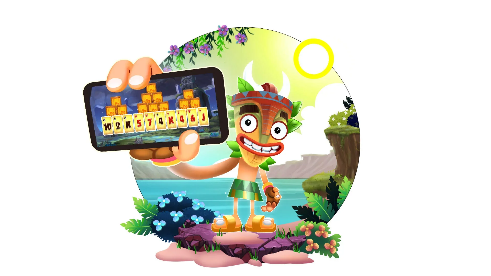
Deep Sea Dive
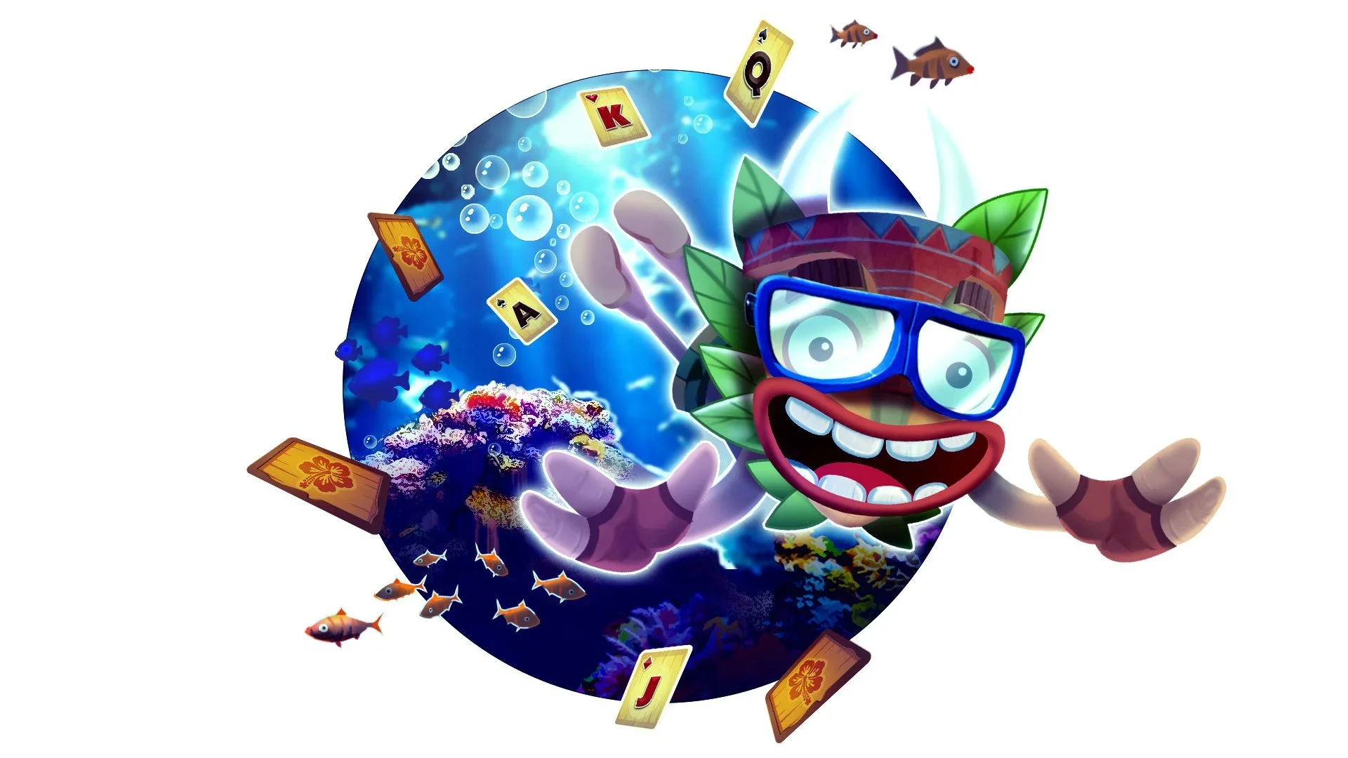
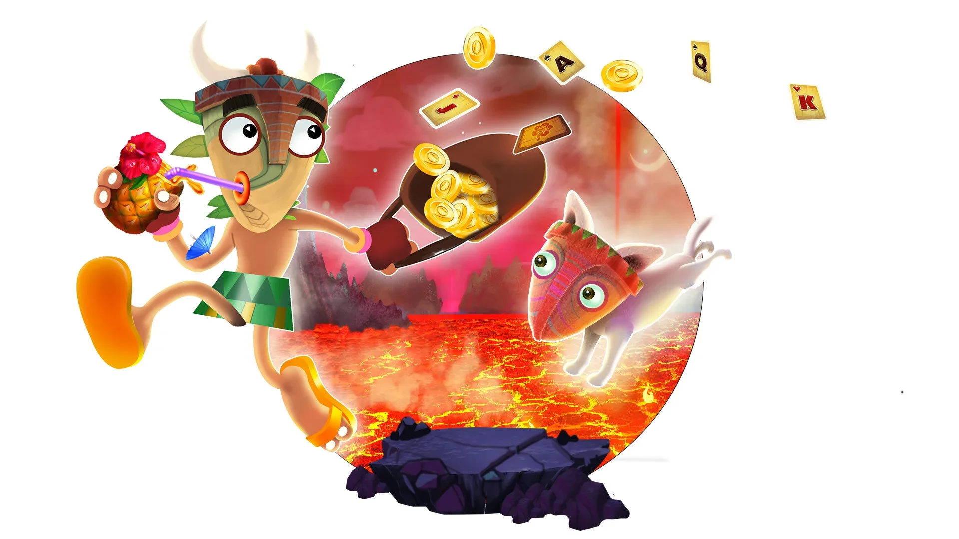
Treasure Run / Lava Chase
Originally featured on the GSN Games homepage (2019–2020) as the hero image representing all apps. This illustration embodied the energy and adventure of the Solitaire TriPeaks world, positioning Tiki as a brand icon across the company’s ecosystem.
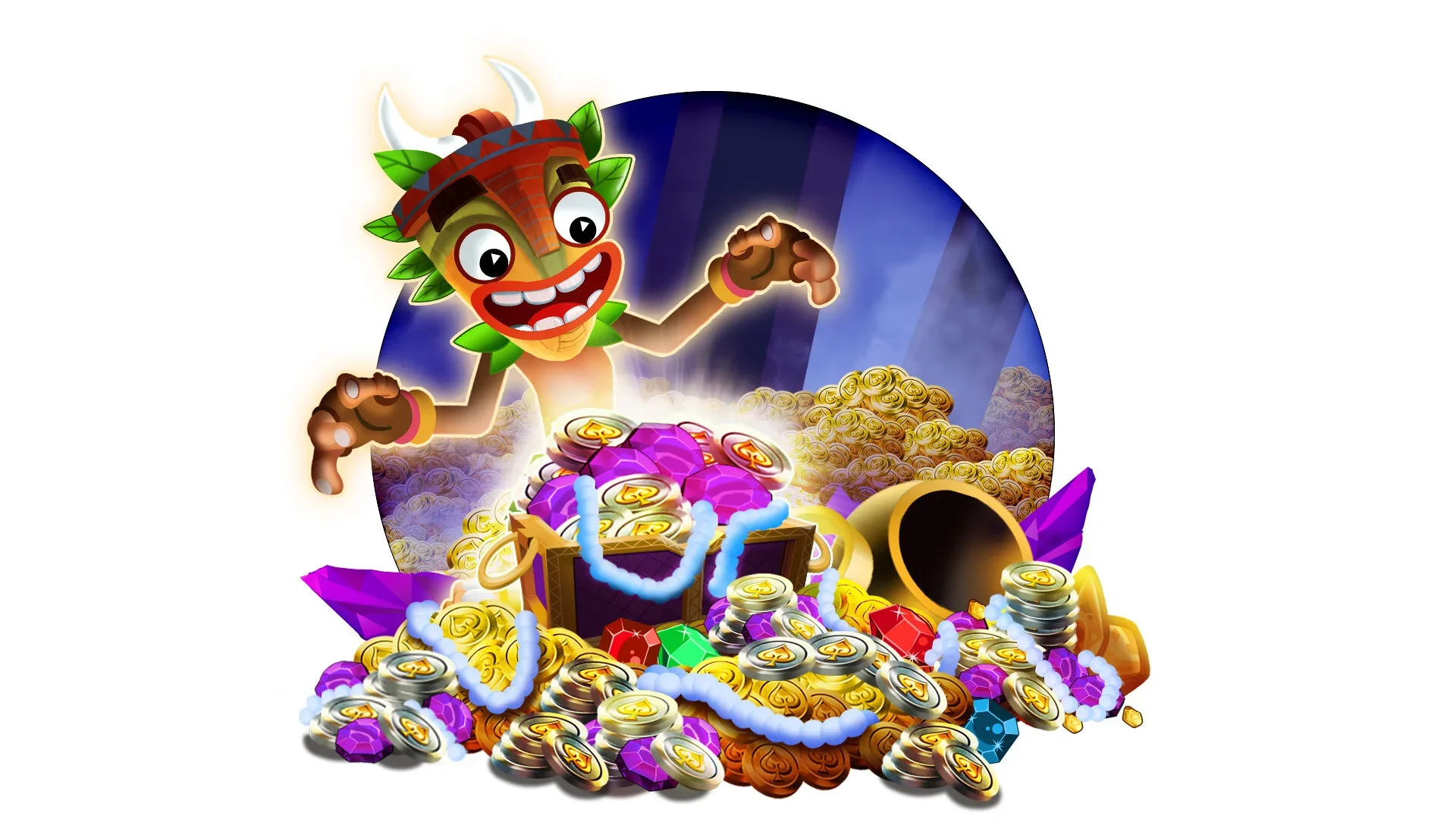
Treasure Scene / Reward
Character & World Design System
These worlds and moments were only possible because of the scalable visual system built around Tiki and his companions using a modular design language that allowed for rapid iteration across tone, environment, and event themes.
As Tiki 2.0 proved the value of expressive, modular design, the next challenge was scalability. Could we build systems that allowed anyone to create animation with the same polish and consistency?
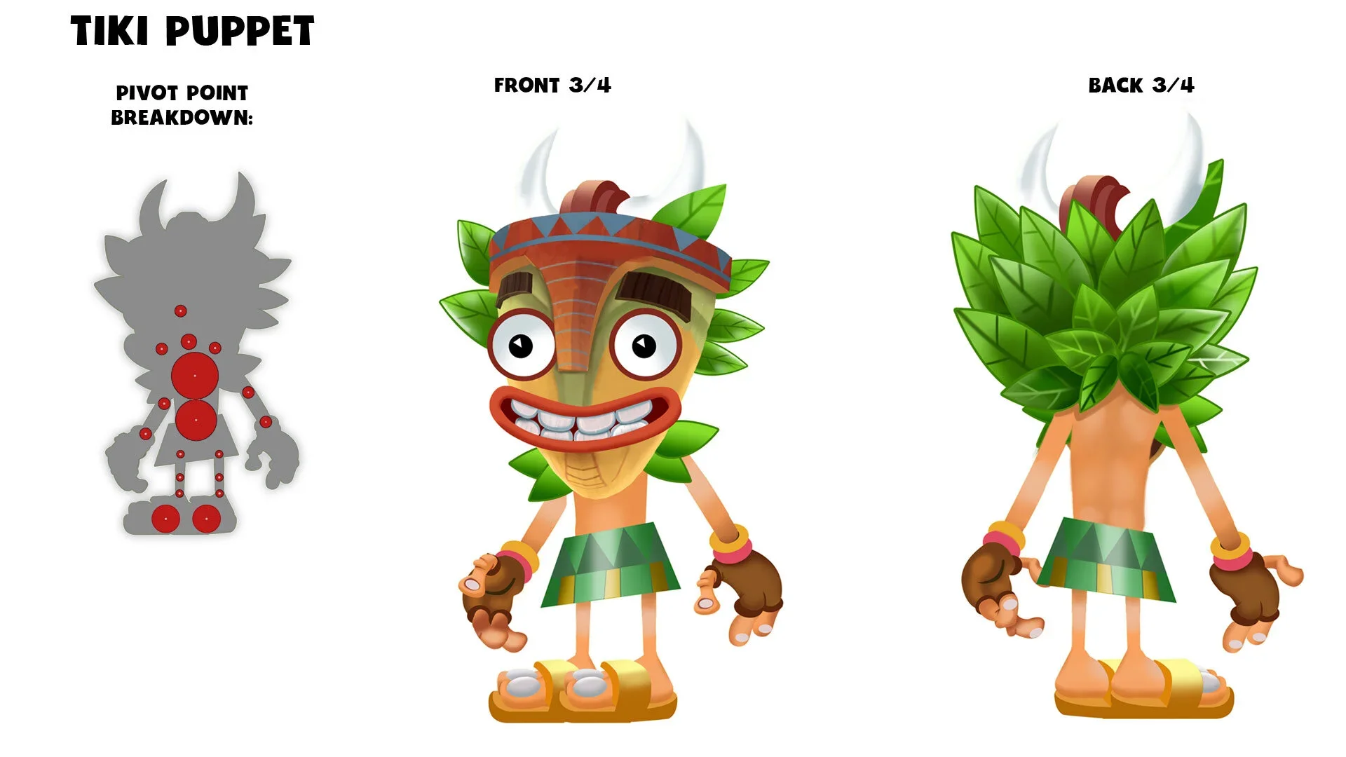
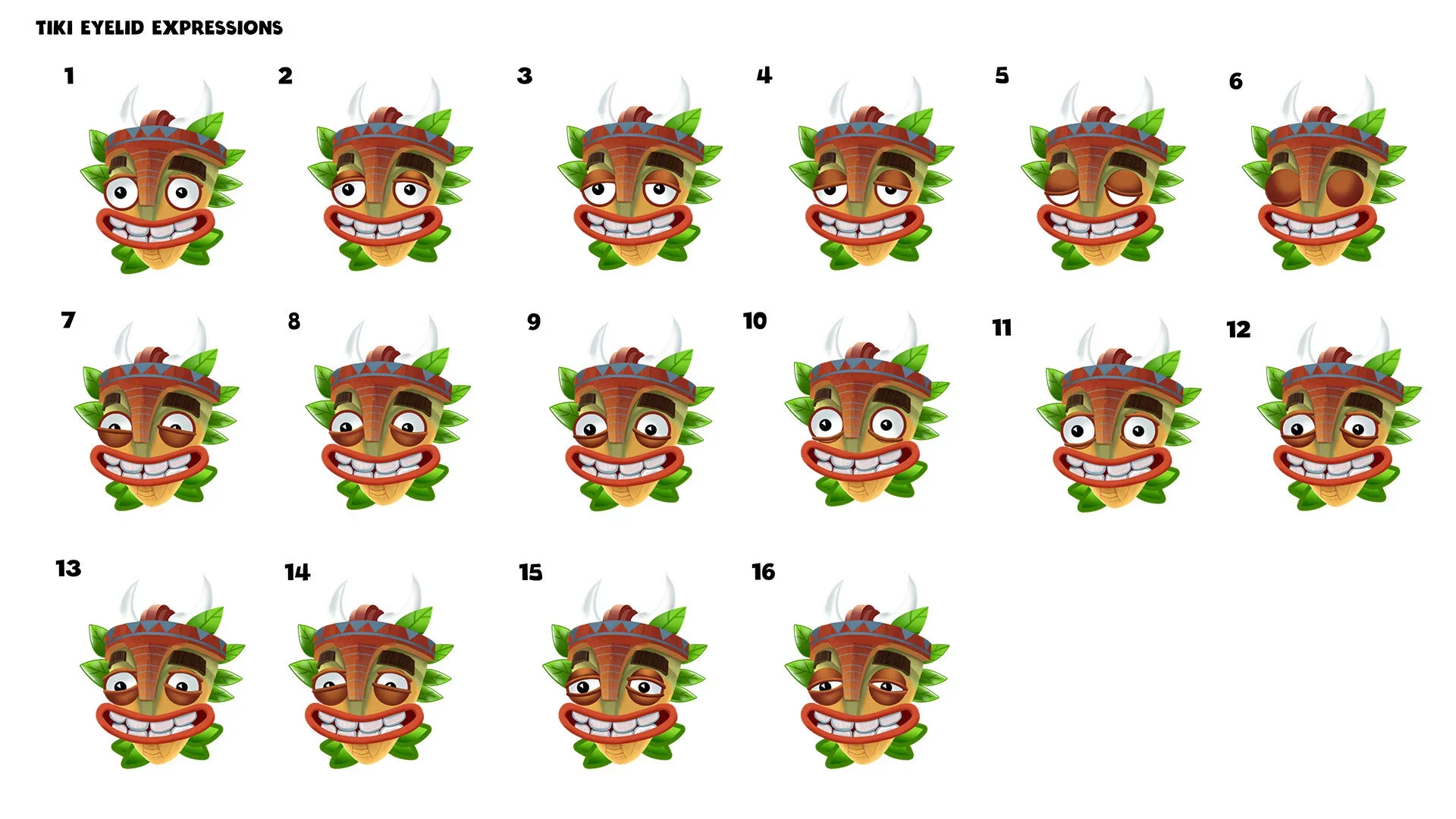
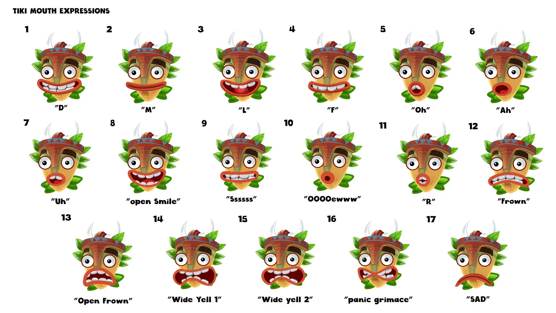
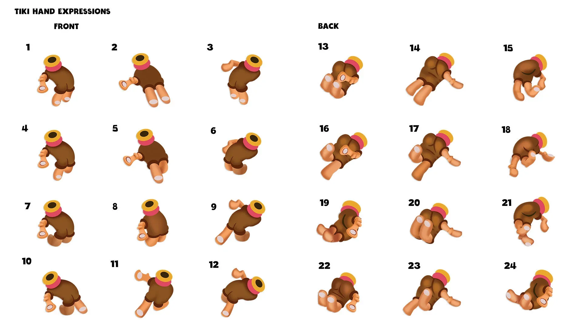
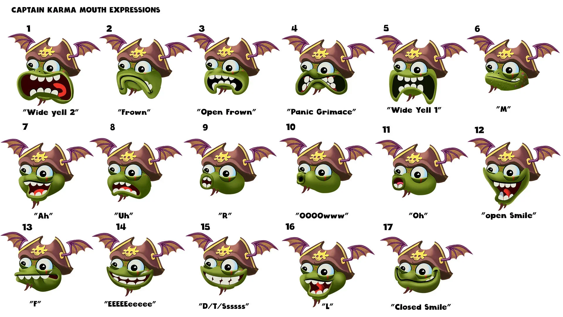
Mini Tiki Rig System (Production Handoff)
A modular documentation set created to support consistent animation production across internal and partner studios.
These rigs detailed full mouth, eye, and hand symbol libraries for the Mini Tikis. defining a unified animation language that could scale across hundreds of variations. Each puppet used rotation-based parenting and pre-composed structures for 3D wrist motion, ensuring technical precision without sacrificing personality.
This deliverable helped formalize the bridge between design intent and production execution. A huge leap forward in making the TriPeaks creative ecosystem both adaptive and future-proof.


Creative Impact & Legacy
Within months, the ripple effects were undeniable. Campaigns built from the new creative system began performing at a competitive level across the entire app category—a shift confirmed directly by Facebook’s performance analytics team. What started as an experiment in narrative-driven marketing evolved into a repeatable playbook for creative excellence.
The system I developed didn’t just generate stronger ads—it taught the organization how to think creatively again, blending data discipline with emotional intelligence. TriPeaks became a case study in how thoughtful design systems can restore the soul of performance marketing—one ad at a time.
Conclusion
The most meaningful outcome wasn’t the spike in installs or retention, it was watching other teams use our tools to build stories we hadn’t imagined.
That’s the real measure of success: when your work stops being “your project” and becomes part of the studio’s DNA.